


High Performance UI UX Web Design Services
Before anything else, a great website should start with one thing: a message. And the clearer and more relevant that message is, the better your customers will know your brand and want your services.
After that, we bring your brand to life with excellent design and amazing user experience.


Don't simply take our word for it. Check out what some of our clients have to say about Spiralytics:
4.5 Star Ratings Globally





Trusted by Leading Brands to Drive Growth
with Targeted Digital Strategies


Web Designers focus with Design because they’re Designers.
- They prioritize design above all else, leaving messaging as an afterthought
- They don’t explain how business impact customers’ lives
- They say “Work With Us, We Are The Best,” instead of actually solving problems


At Spiralytics, we specialize in creating websites that convert. We are a full-scope team that brings together the most important facets of digital marketing into one website building superteam:
Our top-notch CONTENT team telling your story
DESIGN experts laying out your websites
DEVELOPMENT pros making your site fast and responsive
ANALYTICS specialists tracking all your data
SEO architects working to get your brand to Page 1
A team of MARKETING strategist driving new customers



Our Approach For Each Page Of Your Site
Performance Web Design is Spiralytics’ response to templated websites that do your business and your ethos a disservice. Our experts in different fields come together to tell your story and to tell it well.


Our Performance Branding Services
New Website
First time?
Our team will work intimately with yours, getting to know every aspect of your business, and weave your brand’s identity into a narrative that will get your customers excited.
Website Rewrite
Looking for a new perspective? Our Branding Architects take your existing assets and breathe new life to your business.
Website Redesign
Shine and polish? Our design and content teams rework your site with new style and flare.
We're not Like Most Agencies
At Spiralytics, we do things a little differently – and that includes how we build your brand. While most websites are built with an image in mind before anything else, our Performance Web Design process flips the formula.
We approach websites like how your potential customer would, and focus on what actually matters to them. By putting them at the core of the development process, your website transforms into a gateway for people to get to know you and your business more intimately.
We follow a structure that aims to answer your customers’ most important questions first, and give them an experience that will have them engage more deeply with your brand:
- Messaging and Content
- Conversion Opportunities
- User Experience and Navigation
- Calls to Action
- Beautiful Images that Add To Your Message
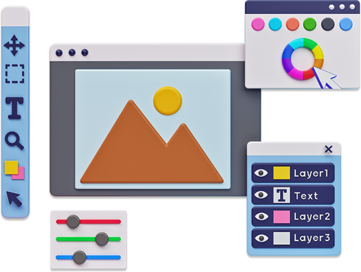
More than anything, Performance Web Design puts your business’ message at the heart of the website.
Frequently Asked Questions
About UI UX Web Design
What does a UX design agency do?
A UX web design agency works with clients to create digital products and services that are easy to use, engaging, and meet the users’ needs. Their services may include user research, interface design, usability testing, prototyping, and project management. They work closely with clients to understand their goals, target users, and business requirements.
What’s the difference between UX and UI design?
UX design focuses on the user’s overall experience, including accessibility and satisfaction. Meanwhile, UI design is concerned with a product or service’s visual and interactive elements, such as layout, typography, color scheme, and other presentational elements.
User interface design is a significant component of the overall user experience. Both are critical for creating successful digital products and services.
Do UX designers do web design?
Yes, they do. Originally, the term UX applied to all sorts of products like food packaging, furniture, and product creation. Now, people use UX and UI primarily to refer to the design of websites, apps, and other digital media.
Why should I care about user experience design?
As UX design focuses on ensuring your products and services are easy to use and effective in meeting user needs, it drives customer satisfaction. A positive user experience leads to higher customer engagement, loyalty, and conversion, ultimately boosting business success.
Which features indicate a trustworthy and effective UI/UX web design agency?
The agencies which offer the best UI/UX web design services generally have a strong portfolio, have positive client testimonials, and can communicate clearly and regularly. A good indicator is the agency’s website. If their site is confusing or frustrating to use, they probably won’t be able to do right by your company.
How much does a UX agency cost?
There’s no standard pricing for UX design, as with most other forms of creative work. Some agencies charge an hourly rate, while others set their prices based on project estimates.
How long does a UX project take?
The scope of your needs dictates how long a project will take. Overhauling the user experience of a website can take anywhere from a week to several months.
Does UX design involve coding?
While UX design does not necessarily involve coding, it can help understand the technical capacity of the website or program. Agencies offering user experience web design services typically focus on research, design, and testing more than programming.
Why are UX designers so in demand?
Businesses want to provide the best experience for their customers. However, not all designers have the knowledge and understanding necessary to optimize a product, service, or platform for users. The disparity between the number of high-performance UX web designers and the organizations that want them creates a highly competitive market for the top UX designers.
