Fight Club‘s Tyler Durden said that “You are not your job“, but I find it hard to disconnect my designer self from the person that I am away from the computer. I think I speak for every web designer when I say that this job changes how we think and act in the outside world without even realizing it. Some good, but some are downright annoying for non-designers, especially for those who date us.
Here’s a list of 9 common designer habits that non-designers find annoying. Does any of these sound like you or your designer friend?
1. Buys a product because the packaging is nice.
A good example of this is when we see a nice packaging of a random product at the grocery. You’ll hear us saying….“This is so MMA!”, “Very nice packaging! I must have it!”, or “Very artsy!”. The next thing you know, we already have that product in the cart. Doesn’t matter if we don’t really like the product itself.
*For people who don’t know, MMA is not Mixed Martial Arts. It is Multimedia Arts. According to Wikipedia, Multimedia Arts includes, by definition, more than one medium, therefore multimedia artists use visual art in combination with sound art, moving images and other media.
This usually happens before we order or as soon as the waitress hands us the menu. From the logo, layout, fonts used, color scheme, packaging, to quality of photos – we’ll spend 5 or more minutes just ranting about every single detail that we think doesn’t work and how they should have done it. Want to date a designer? Better take them to a place where the menu isn’t crap. Or just get used to us, you’ll learn a thing or two about design from our menu critiques. 😉
3. Downloads every beautiful font they see.
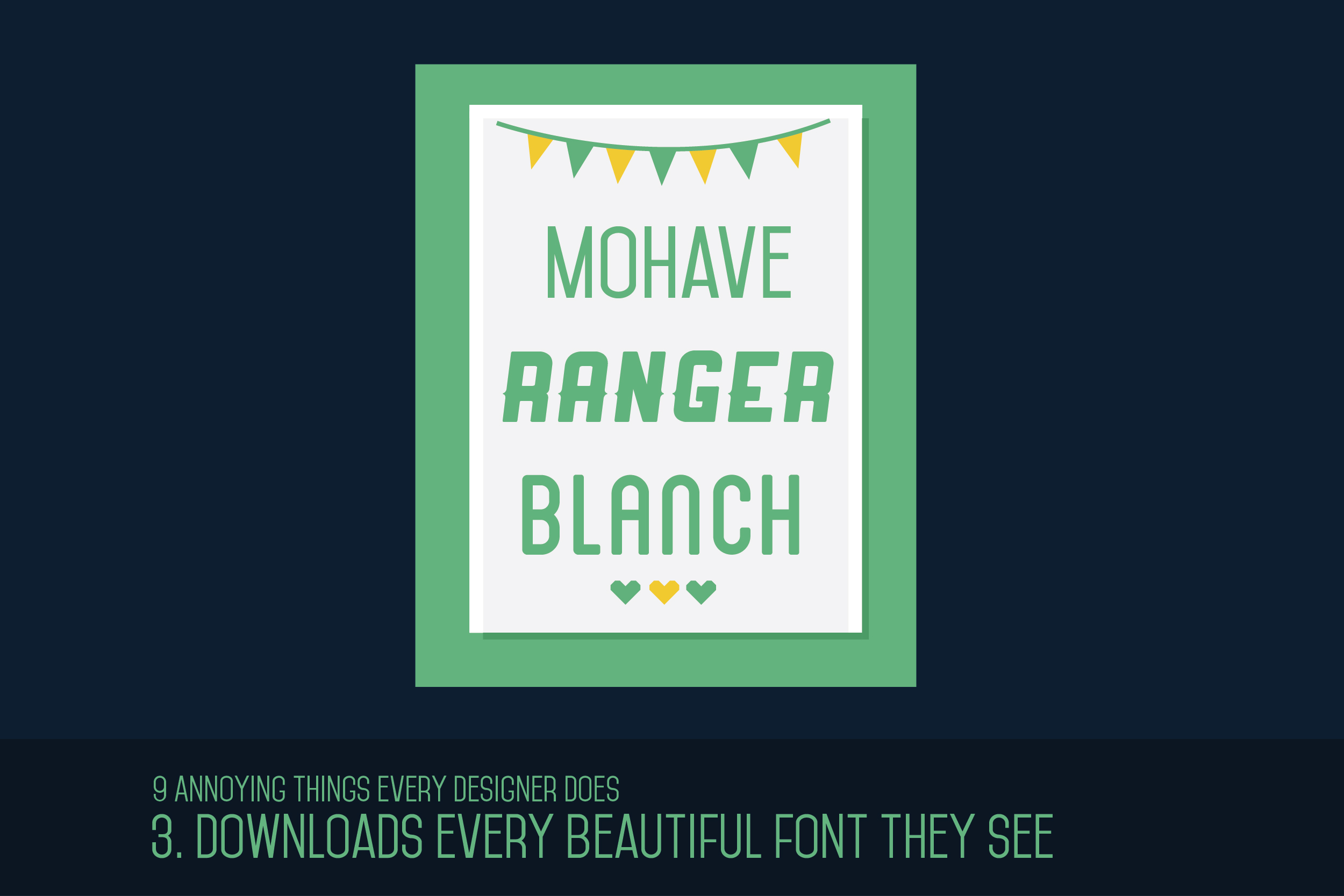
This happens usually when we visit artsy websites with freebies section or articles that showcase free fonts. When we see a font that we like, we HAVE to download it, as if our life depended on it. By the way, I mentioned in my previous article some websites where you can download some design freebies.
Freebies Alert: You can download the fonts I listed above here!
4. Listens to music you’ve never heard of.
There’s this time when my friends and I were on a trip. The designers, myself included, decided to plug in one of our iPods, played around 3 songs while singing at the top of our lungs. The rest of the group had no idea what songs were playing, saying “You really have weird taste in music.” Our choice in music is actually a great conversation starter!
5. They make your Instagram photos look like trash.
Admit it, you’re like “Why does this designer take much better photos than me?” when you check our Instagram. Here are some of our Instagram secrets:
- Good framing. Look for the best angle. Don’t be afraid to stand up or arrange the position of your subject. Remove any unnecessary objects that will hinder the beauty of your photograph
- Use only 1-2 filters. Forget about Instagram’s default filters and start downloading third party apps. I recommend you use CameraBag, VSCOcam or Whitegram to have a better control over the final look. They’re really great third party apps used by both amateurs and professionals.
- Stick to a theme. Choose only what to post such as travel, fashion, breakfast meals, or sports.
- Use pretty objects as your props.
- Use natural light to avoid grainy photos.
6. Critiques every advertisement they see.
We not only critique restaurant menus, we also do the same thing with billboards, online ads, and posters. If we see these things in an ad, we probably won’t buy the product: bad layout, crappy images, much bigger logos, mismatched colors, having more than 3 typefaces in a single design, and the Comic Sans font.
BREAKING NEWS: Speaking of Comic Sans, have you heard about the new Comic Sans Neue? Do you like the makeover of the most bullied font?
7. Will close your website if it’s old school.
The first thing a designer sees in every website is the design of course. If it doesn’t give a good impression in the first few seconds we’re in it, we’re out of there. We’ll be like “Ugh, this website is so Web 1.0“. You should consider Googling “Web Design Trends for 2014” to make designers stay in your website. I’ve worked on a ton of websites as a designer for a company in the industry of Digital Marketing in Nottingham and the Philippines, so I know what a good website looks like.
8. Gets mad if they ask you for a high-res photo and you paste it in Word.
If you want to piss off a designer, send a photo pasted in Word. Seriously though, why do people still do this? If you want us to give you an output in high-res and good quality, just send it as a file. Pasting it in Word is not the same.
9. Prefers beautifully designed front book covers.
Like #1, we are also easily convinced to buy a book if we like the cover. I know, I know, don’t judge a book by it’s cover, right? But we can’t help it. The only thing we’re thinking every time we see a book cover we like is “This would look so great on my shelves”.

Your thoughts?
Have something to add? Let us know in the comments.


