As we know by now, digital marketing waits for no one – platforms are continuously evolving, giving advertisers more and more opportunities to showcase themselves to an ever-growing audience. With new paid advertising technologies and features coming at us from all fronts, it’s easy to get overwhelmed. There are just so many new things to address when it comes to targeting, placement, and format.
Though this may be the case, some things never change. In my experience as an online advertiser, certain principles always hold true – these truths are at the core of every campaign I’ve done, no matter the time or channel. They’re so integral that they’ve persisted since the dawn of online advertising, way back to when the world experienced its first banner ad.
The First Banner Ad

The first banner ad is from AT&T which went live on the (now defunct) HotWired website, an online publication which went live (along with a cacophony of banners including the one above) all the way back in 1994. Two decades after the first banners went live online, we can still look back to them for wisdom on how to advertise online.
What We Can Learn from The First Banner Ad
1. Talk to your audience
The copy was cheesy, sure, but it worked. In a time where the internet was still this new frontier, people had no idea what could be done, randomly clicking on any surface their mouse pointer reached.
Imagine telling these people, blindly and furiously pointing at anything they can find: “Yes, this is something you haven’t clicked yet but it will bring you somewhere!” The clarity of the instruction tells people what to do, yet the vagueness of the message leaves them wanting to know more.
The beauty of the Internet’s first banner ad was that it talked to its audience like human beings and used natural human curiosity to its advantage. In the early stages of the internet, most people online were usually satisfying an exploratory need. AT&T’s ad leveraged this motivating factor brilliantly.
2. Adapt to the environment
HotWired was something of an inventory placement – they contacted companies directly, offering them portions of the site related to their business. Volvo, for example, sponsored On the Road, HotWired’s travel segment. On the other hand, AT&T was offered Retina, the arts and culture segment. Though not an obvious choice, AT&T saw this as an opportunity to promote their service’s primary equity – a connection with the rest of the world they could never have had the opportunity to have.
At the heart of AT&T is the promise of unbounded information from anywhere, and art and culture were at the forefront of what people wanted to know most about the rest of the world. Not an expected route for AT&T to take, but they adapted to what they were given in the best way possible.
Also Read: Guide to In-App Advertising | Spiralytics
3. Content is king
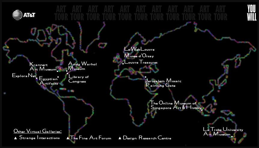
The banner led to a landing page that invited people to know more about AT&T and its services, save for one peculiar link at the top of the page. It read “Have you ever toured an art museum without leaving your seat?” That line would lead to this:

A visual map of some of the world’s most prominent galleries and museums which already had websites at the time. This simple piece of content, which linked people to museums from across the globe, was the perfect blend of AT&T’s promise of information and Retina’s subject matter. Museums have always been the gateway to culture, and AT&T brought the world to people without them ever leaving their seats.
“Have you ever clicked here? You Will” takes on a new life and becomes something close to “Have you ever gone here? You Will.” And this content carried the mission of AT&T accurately: to connect people with their world everywhere they live, work, and play.
4. Be there before your competitors
Place yourself in the 90s – nobody knew what power the internet could bring to people, more so advertising on it. The only thing these advertisers knew was that they could put banners on a certain portion of the website, they could link that banner to any page they pleased, and that doing so cost a lot of money.
Even with that much uncertainty, they took the risk and it paid off, generating click-through rates of 40-44%. Though there was no precedent, knowing close to 1 in 2 people who saw the banner went to their site showed incredible promise in the practice. That much traffic brought in incredible revenue for both HotWired and its advertisers.
5. Go Big
But beyond the visits and the revenue, what AT&T (and Volvo and all the other advertisers who launched their first digital campaigns along with HotWired) did was innovate in a brand-new field. They paved the way for how we see digital marketing to this day – innovate how you call out to your audience, and keep them interested with an offer they can’t resist. This is all the more important in a world with decreasing attention spans.
Though banners have become the bane of a lot of people’s online experience (and spurred the birth of ad blockers), huge investments are still being put into programmatic and self-serve display ads. Understandably so, since online advertising has maintained a strong ROI. The industry we see today was only made real by a group of companies who had no idea what they were getting themselves into but did so anyway.
This thriving industry is still going strong decades later, all because somebody had the guts to ask if anyone has ever clicked their mouse on a random spot on a brand-new website—and everyone did.
In a world with continuously evolving ad formats, the burden is now on us marketers to innovate with what we have at our disposal and transform them from mere banners into vehicles for connecting brands with their audiences.
Seen any new and innovative banner designs lately? Let us know about them in the comments!


